Building the way for Korea. Leading the way to the world.
Creating
a way for you and me.
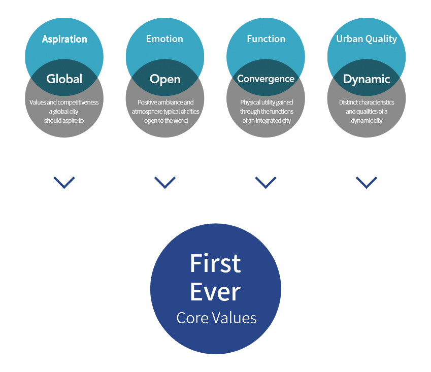
Core Value: First Ever (More than simply the first, becoming the best)
Incheon is home to so many "first ever" developments in Korea. Incheon aspires to be an innovative city that does everything first in Korea. It wants to become a city that does everything the best in Korea. As such, being the "First Ever" is a core value championed by Incheon as part of its city brand. "First Ever" represents the dynamism of Incheon, its courage to take on new challenges, and willingness to open new doors for Korea. Simply put, it represents the spirit that has helped Korea grow into the country it is today.
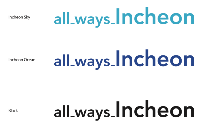
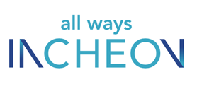
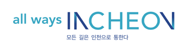
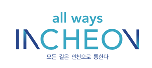
Slogan: all_ways_Incheon
"All Ways Incheon" means that Incheon is building the way for Korea, leading the way to the world, and creating a way for everyone. It represents where Incheon currently stands and the direction in which the city wishes to progress towards moving forward. Also, it helps the public understand the message and values Incheon hopes to convey with its city brand.
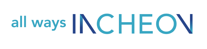
Brand Identity
Incheon's brand identity was inspired by the shape of a lighthouse ("I": Palmido Lighthouse) and a bridge ("N": Incheon Daegyo Bridge), both of which are symbols found on the "First Ever in Korea, Incheon's Top-100 Attractions" list compiled by Incheon Metropolitan City. The word mark shows how Incheon opens the way, connects the way, and builds the way for Korea. Furthermore, the brand identity uses two N letters to indicate "connection and expansion," two characteristics that are representative of Incheon as a city.
Basic Design
The basic type is the most typically used design for Incheon's brand identity. Incheon recommends users to use the brand identity combined with the slogan (including the tag line).

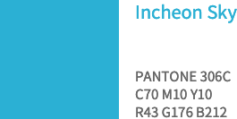
Brand Exclusive Colors
Light blue and deep blue were used to represent the sky and ocean, both of which are ways that lead to Incheon, in the BI.

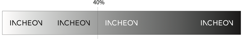
Black/White Version (depending on background brightness)
If a white background is unavailable, the BI image can be used in white. If the background is more than 40% black, use the BI in white. When using the BI in its original colors, even if the background brightness falls within the required range for the BI's original colors (blue), the background must not be in a color that is complementary to the blue colors used in the original BI color scheme.
For more details, please read the "Incheon Brand Guidebook."