
Description of the Symbol Mark (City Emblem)
- Combined together, the Chinese character for water/river "川" and the circular shape "○" represent constant movement and infinite potential of Incheon as a city.
- It is a symbol of an international hub with products, services, and information flowing through its ports and airports.
- The symbol represents Incheon's future vision as a major gateway to the world and a hub for Northeast Asia in the 21st century.
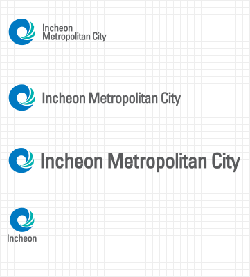
Symbol Mark Logotype
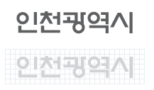
A_type - Horizontal combination
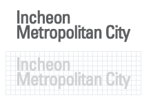
B_type - Horizontal combination
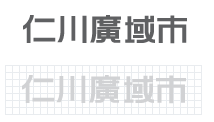
C_type - Horizontal combination
User Regulations
- The symbol mark (city emblem) represents Incheon's image as a city. It is the most critical component in the overall C.I. for Incheon. As such, use the symbol mark on various internal and external events and publications to promote the desired image. However, please exercise caution to use the symbol mark correctly in compliance with relevant design-related regulations.
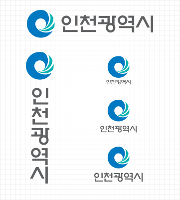
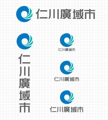
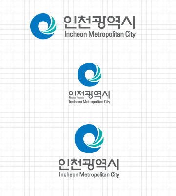
Symbol Mark Signature
User Regulations
- The signature was developed specifically to combine the symbol mark and logotype effectively, and thus, establish a more consistent image across the board for Incheon Metropolitan City. Depending on the media outlet, the signature can be adapted into different formats. Also, Incheon has developed a signature system in multiple languages - Korean, English, Chinese, Korean+English - to make sure its signature can fit the function and purpose of different platforms. As such, when applying the signature, the user can use a vertical combination or horizontal combination (no particular priority). However, beware that the user cannot change the proportions, spacing, and size of the signature under any circumstances, and must comply with the stipulated color scheme at all times.
Symbol Mark Color Scheme

Incheon Blue
- Pantone
- 300C
- CMYK color
- C100+M44
Incheon Green
- Pantone
- 326C
- CMYK color
- C87+Y38
Incheon Gray
- Pantone
- 425C
- CMYK color
- K77
User Regulations
- The color scheme is another fundamental element, along with the symbol mark and logotype, that best represents Incheon's identity as a metropolitan city. In principle, the symbol mark must retain its exclusive color scheme at all times. However, under unavoidable circumstances, the original color scheme can be replaced with the four primary colors. When specifically referring to the symbol mark's exclusive color scheme, the user must emphasize the fact that the colors have been developed specifically for Incheon Metropolitan City, rather than generic colors available publicly. Also, when using the colors from the exclusive color scheme, the user must use a sample color palette to make sure the correct colors are applied.
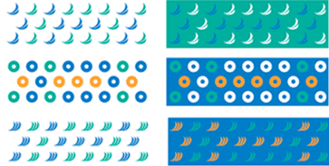
Symbol Mark Exclusive Patterns
Basic Pattern Colors
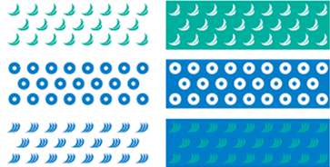
Applied Pattern Colors
User Regulations
- Users can apply the exclusive patterns as supplementary features on applications that require decorative flourishes. In principle, the patterns should use colors from the symbol mark's exclusive color scheme. However, the user may use other colors if required. Moreover, when applying the patterns on the background of a particular application, the user may adjust the transparency/opaqueness to make sure the pattern does not interfere with the main content.